Project Details
Personal Project
2 months in my spare time
Sketches, wireframes, & Mockups
Figjam & Figma
Problem
KSL Classifieds is a popular app for selling items in Utah, Idaho, and Nevada, competing with platforms like Marketplace. After successfully selling my car on the app, I saw an opportunity to redesign it. Working primarily in enterprise software, I rarely get to showcase my visual design skills, so this project was a chance to demonstrate my capabilities.
Solution
After analyzing the goals, I realized that the app's primary functions—buying and selling—were not clearly represented in the navigation structure.
Site Map Redesign
I began by reorganizing the site map. While the app had all the necessary pages, their order needed restructuring to enhance user flow.
Old
New
Navigation Bar Adjustment
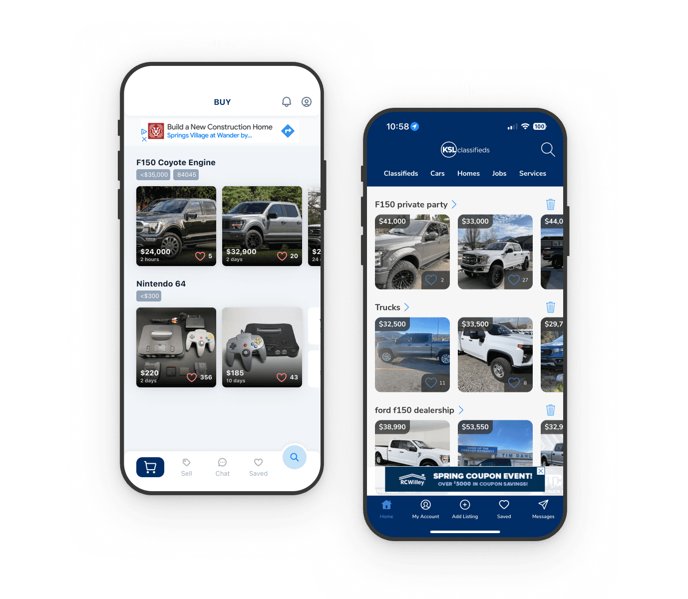
I revamped the bottom navigation bar, creating a dynamic action button that changes based on whether the area of the app you are located. If you are buying, your main action is to search. If you are selling, your main action is the list.


Page Improvements
I focused on enhancing the visual design and hierarchy of existing pages. This included improving the aesthetics, optimizing heirarchy, and adding functionality to enhance user engagement.


Business Considerations
Understanding that ad revenue is crucial for the app, I ensured that the redesign preserved and potentially enhanced ad placements without disrupting the user experience.


